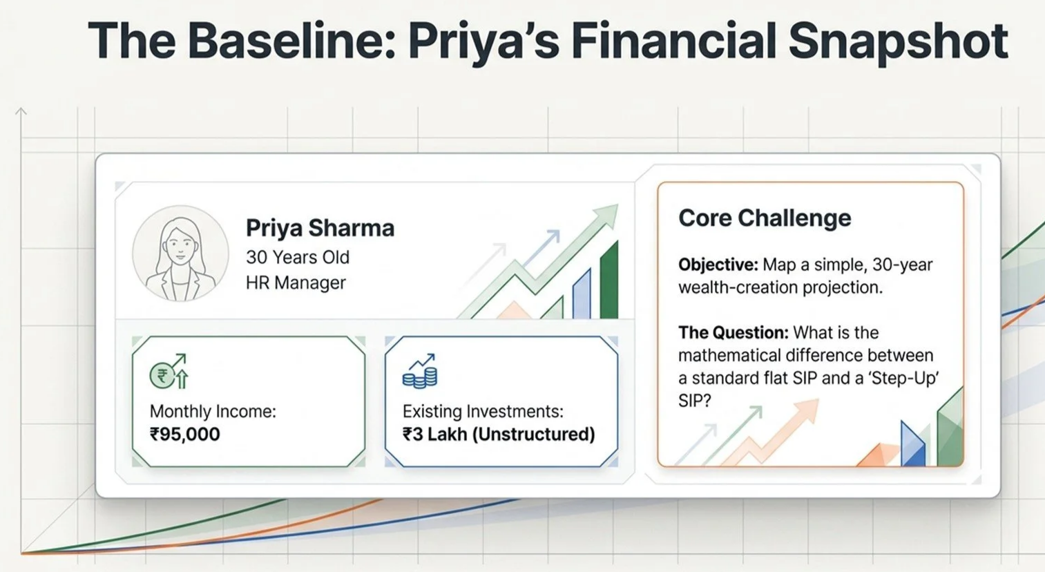
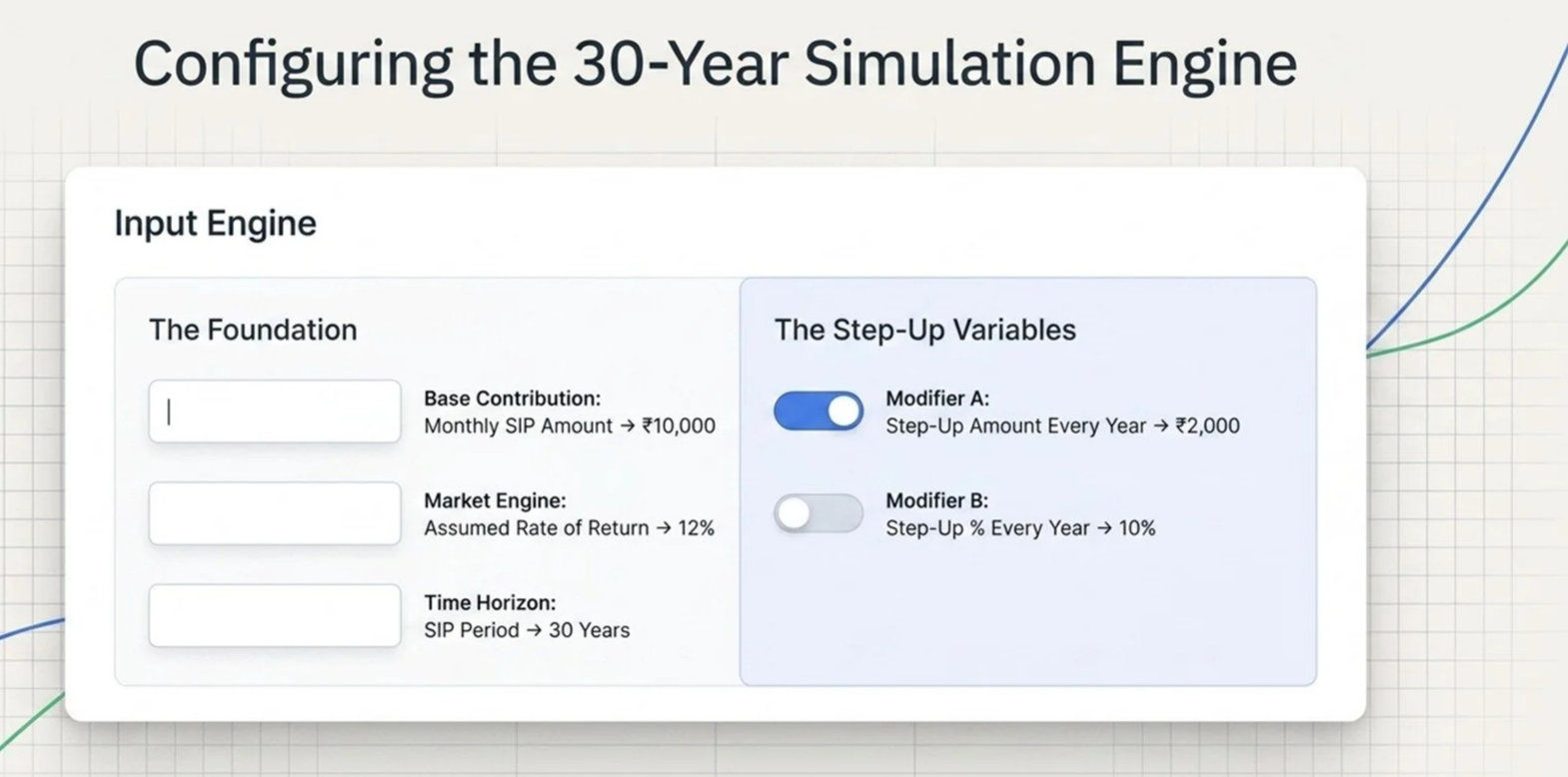
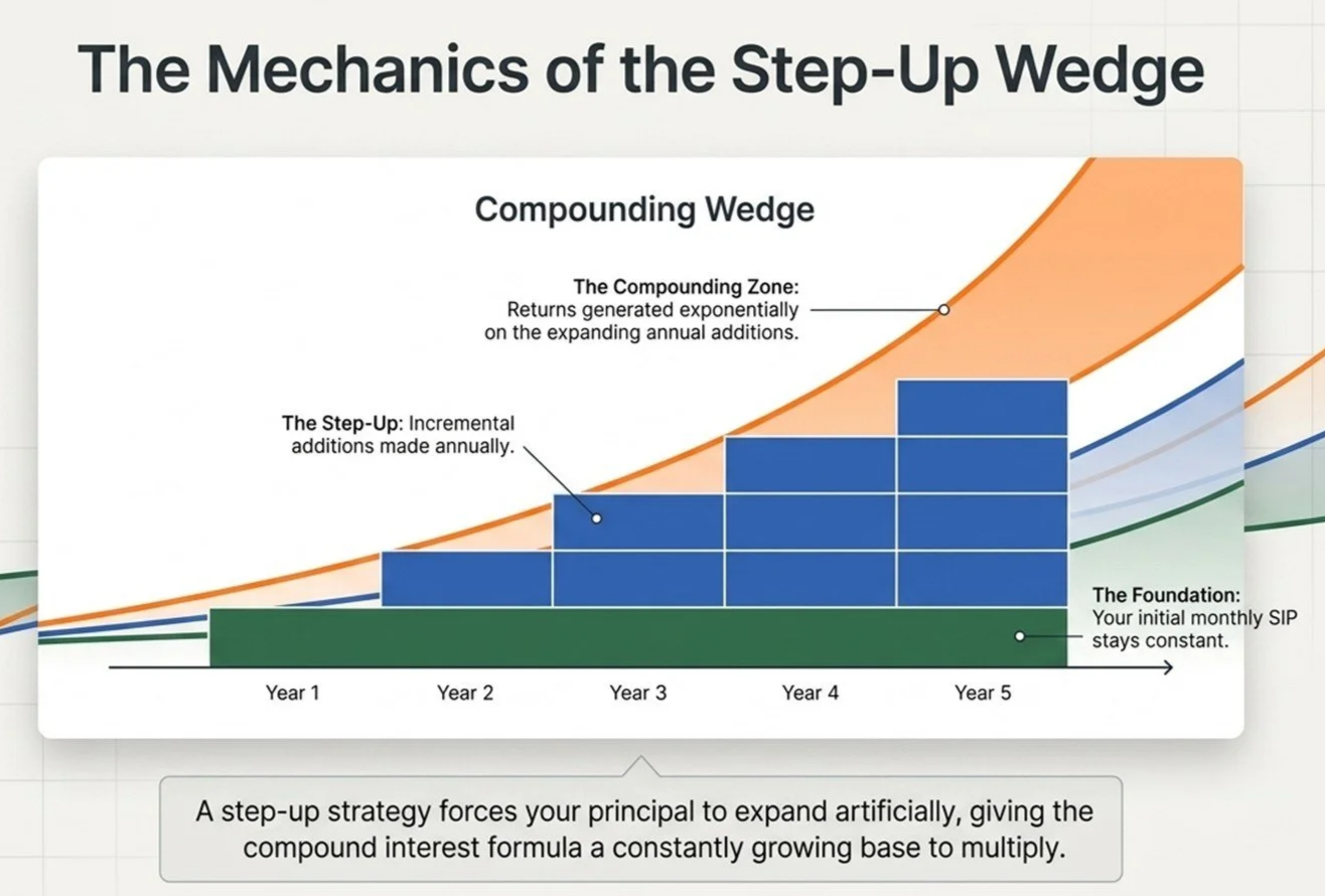
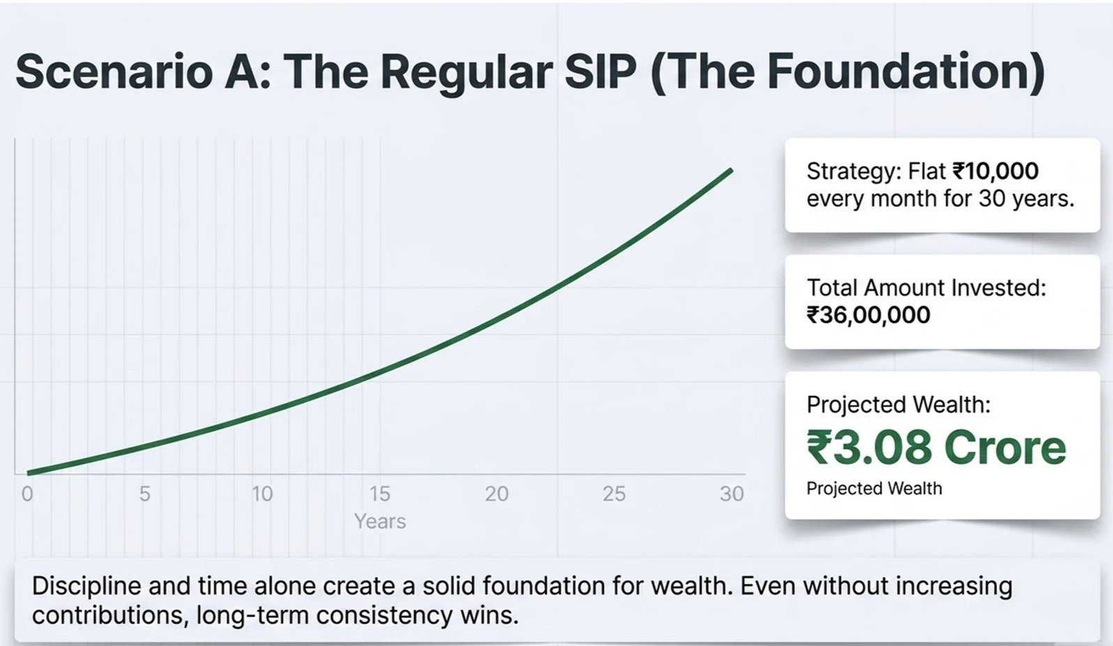
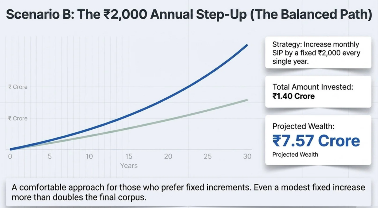
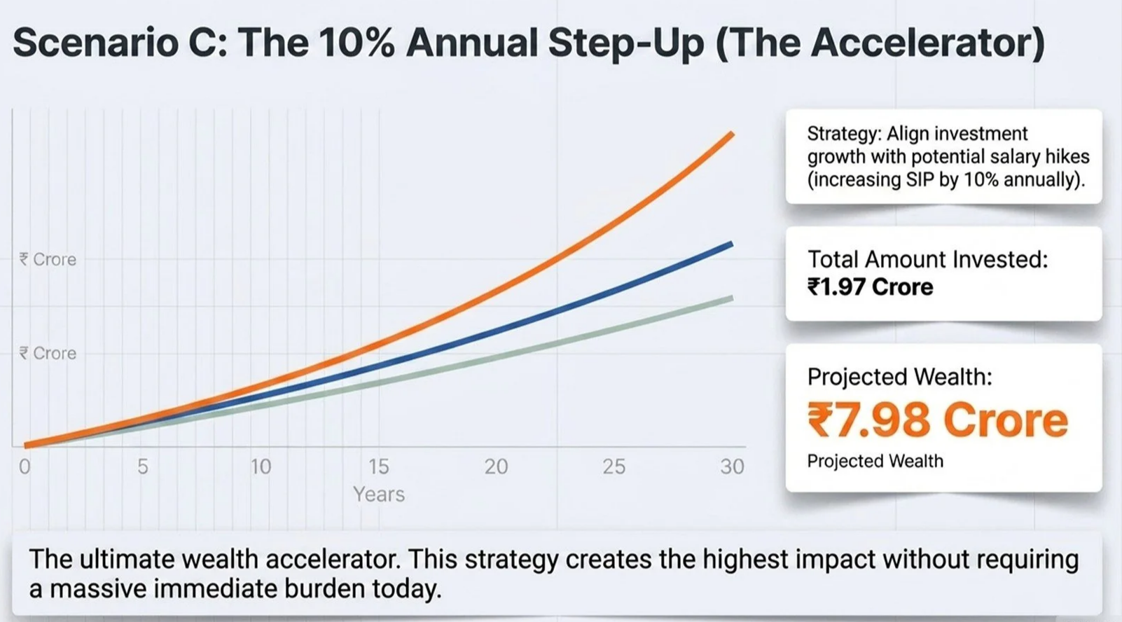
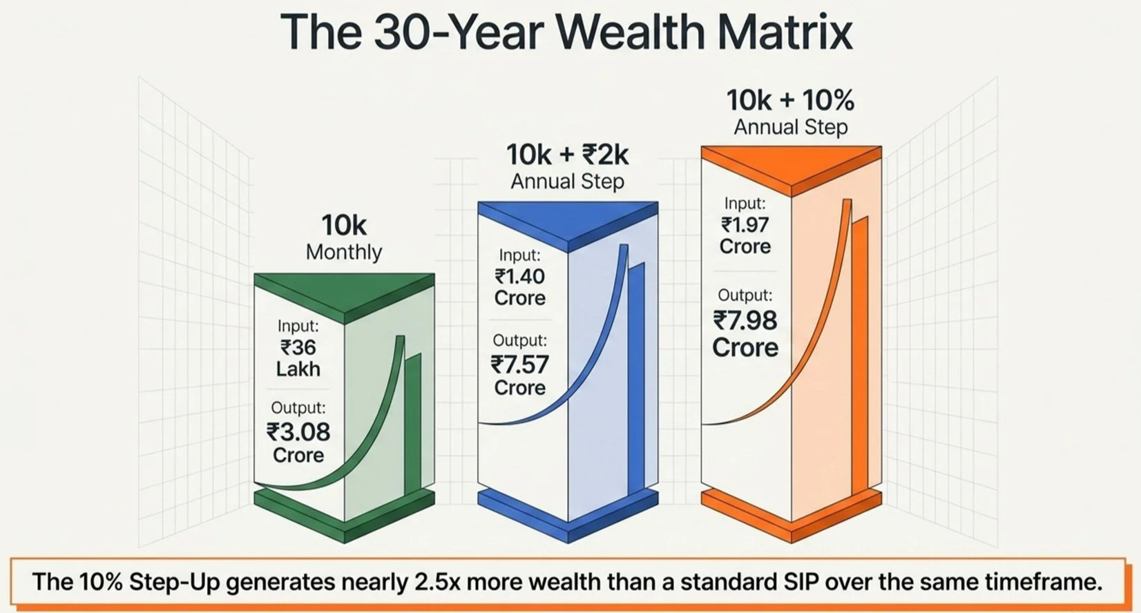
NORMAL SIP Vs STEP UP SIP
Let’s see how increasing the initial SIP of Rs.10,000 per month by 10% every year can accumulate Rs.5 Crore more as compared to Normal SIP over a period of 30 years.
3 Crore Vs 8 Crore
To know more, feel free to contact us.
From Our Investors
-
![Testimonials]()
AN AMAZING GENTLEMAN WHO PLANS YOUR INVESTMENTS FOR YOUR BRIGHT FUTURE.... PLEASE DO PAY A VISIT AND IF YOU ARE CONVINCED, I AM SURE OF WHICH YOU WILL BE ... YOU WILL AUTOMATICALLY WILL INVEST
Colonel Puneet Khanna
-
![Testimonials]()
A great help for investors. It is the best platform where everyone is free to clear their doubts regarding investment.
Dr. DURGESH AGNIHOTRI , Associate Professor - PSIT Kanpur
-
![Testimonials]()
I approached Hari by recommendation of one of my friend because I asked for an independent advisor not employed by a bank and not committed to sell the bank’s financial product. I read articles in Financial Kundali and they were real eye opener. Products which I thought can be investment are actually not. Hari is a BRILLIANT financial planner and he has all of the best qualities of a professional adviser.
SHIVANGI GUPTA
UniSuper Automation Test Consultant,
MELBOURNE, AUSTRALIA
-
![Testimonials]()
Earlier, Financial Planning was like a nightmare for me. But Hari’s insightful advice went a long way in changing my outlook towards money and helping me achieve my financial goals. I would really recommend Hari as an experienced financial consultant to help you with planning your portfolio and achieving financial freedom!
RAAHUL SINGH GAUTAM,
Capgemini Senior Consultant, Mumbai
-
![Testimonials]()
Description goes hereI am one of the those very few people who attached with Financial Kundali in its Starting stage. Mr Hariom Tripathi ji is very nice person and he is having good knowledge.
DINESH SINGH CHAUHAN,
Balrampur Chini Mill
-
![Testimonials]()
Phenomenal website. Boon for guys like me who are challenged with Financial Quotient. Articles are as easy as pie, limpid, lucid & articulative. Besides, enough fodder is available for intellectual nourishment. I was personally impressed by an analytic and interpretive article which compares PPF & LIC as tax-saving investments.
GAURAV TRIPATHI,
Manager, Indian Overseas Bank, LUCKNOW
-
![Testimonials]()
Great experience. They have in depth understanding and are able to align the financial goals with investments. Above all, they are passionate about their work. Highly recommended!!
SHRIDHAR RATHORE, TCS, USA
-
![Testimonials]()
It was a nightmare when while my Financial Planning Discussions. Hari Om analyzed on how i was investing in my insurance policy for 21 years and getting a very nominal return. With his guidance I invested partially in Term Plan & Mutual Funds. Now I am fully insured & expecting a 40-50% more return from my last policy & guess what my money is not blocked for decades for God sake. Hari trust me this is a charity you are doing to World. Thanks for saving my Money. All the very best.
GAURAV TRIPATHI,
Godrej & Boyce Mfg Co. Ltd., Manager Storage Solutions, New Delhi
-
![Testimonials]()
I am absolutely delighted with your service. It's really refreshing to work with a financial adviser who is truly interested in their client's needs, circumstances and preferences. What really impressed me was the way you took the time to get a feeling for where i was at, your depth of knowledge, lateral thinking and your common-sense approach. Your professional, ethical and caring demeanour elicits my trust and respect and I gladly recommend your services whenever possible.
RONAK TANDON, FUTURE TRUCKS KANPUR
-
![Testimonials]()
A very good initiative has been taken by Mr. Hari Om Tripathi to work on this way. This site is a very effective tool to cross check all your financial myths. As a layman people generally find it difficult to get the right product as per their financial need or goal. This site is making them self-enabled to judge the right product. It is covering almost all the financial products and giving insight on that. Overall, a great financial site that i recommend.
DEEPIKA SINGH
Axis Bank, Deputy Manager, New Delhi
-
![Testimonials]()
A Way to start your Financial Life While searching for some financial planning related websites, I came across this website. I liked the site very much. It provides all the basic information for common people to improve their financial Life. It has very good services like Free Financial Health Check list, Goal Based Investment, How to manage your Financial Wealth etc. All the topics are discussed in a nice way. As a newcomer to making financial decisions I have needed all that I could get. Hari Om has always shown great patience and explained things clearly and thoroughly without being patronising. He always respected my wishes with regard to risk taking and made me feel comfortable with the decisions I have made.
MAHESH MAHATEKAR,
Xecom IT Pvt. Ltd., Lead QA, Pune